Benecol
The silent one
ROLE:
Art Director
PROBLEM
High cholesterol affects around 60% of UK adults, and most don't know it. There are no symptoms, no warning signs — which makes it one of the most quietly dangerous conditions in the country, and one of the least effectively communicated by the category that treats it.
SOLUTION
Benecol already has a clinically proven product and a clear proposition. The actual gap was tonal — most category advertising is education-first, benefit-led, and visually busy, when the condition itself is the opposite: silent. The brief was to make people feel the absence of symptoms, rather than just read about it.
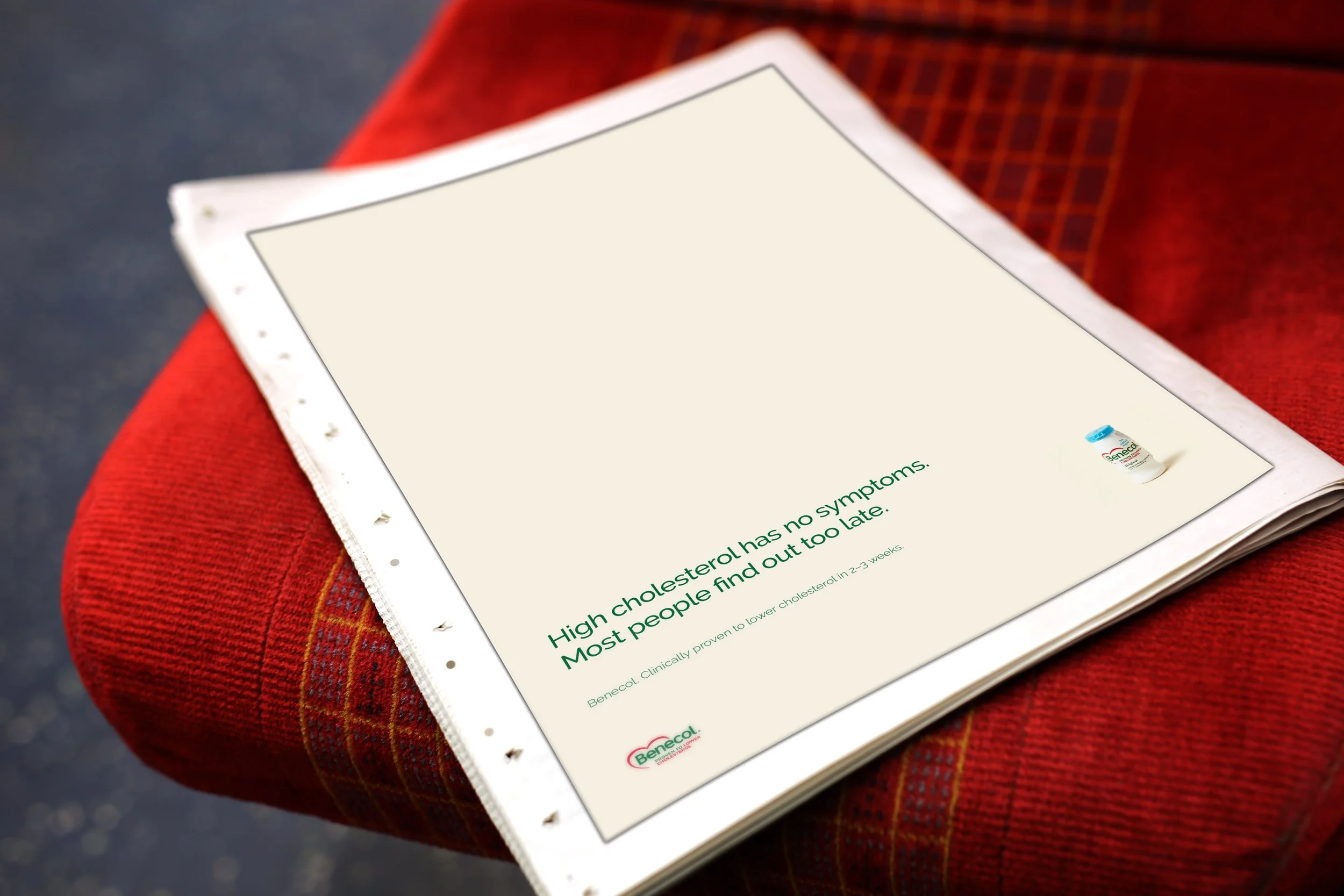
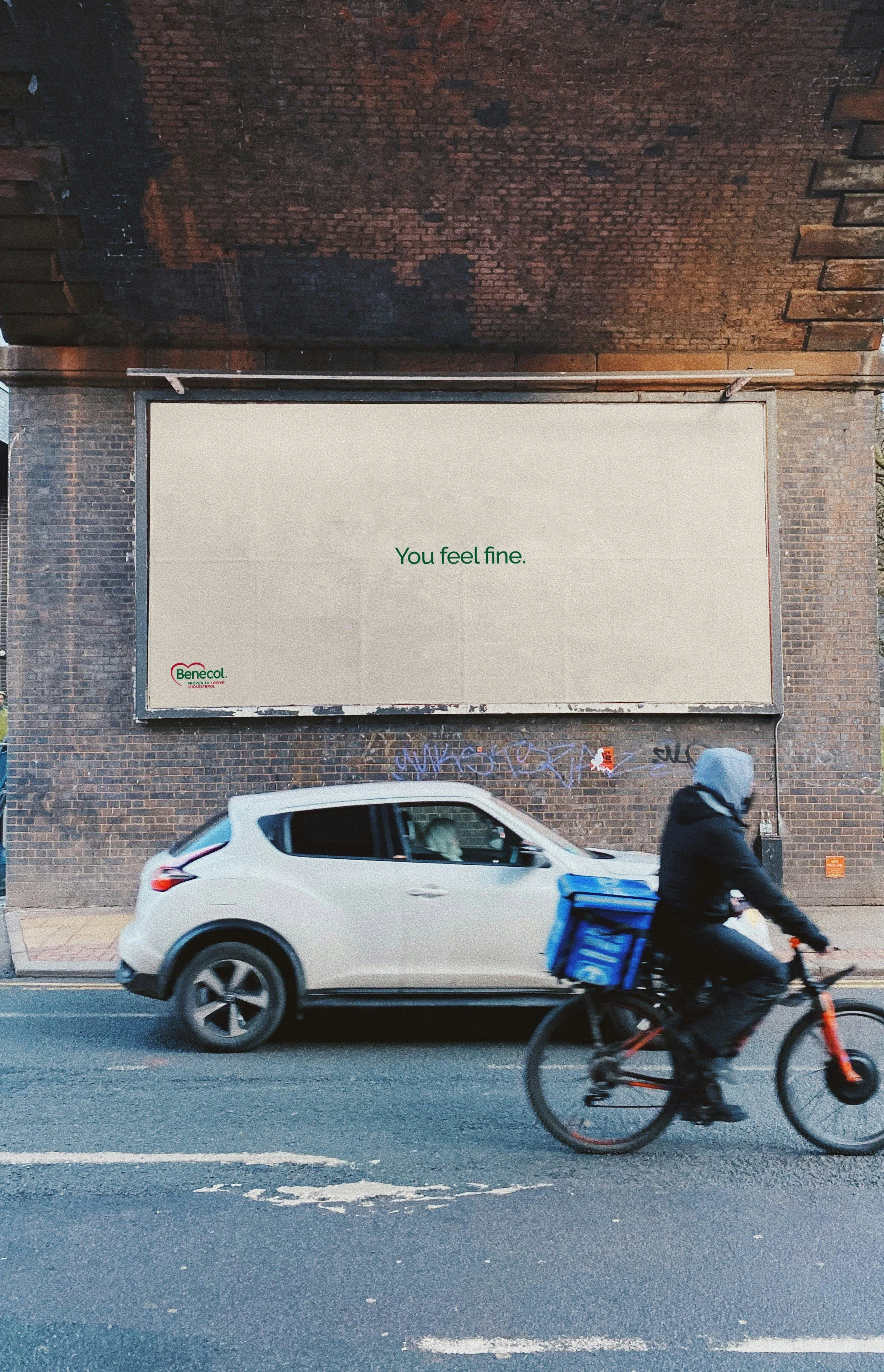
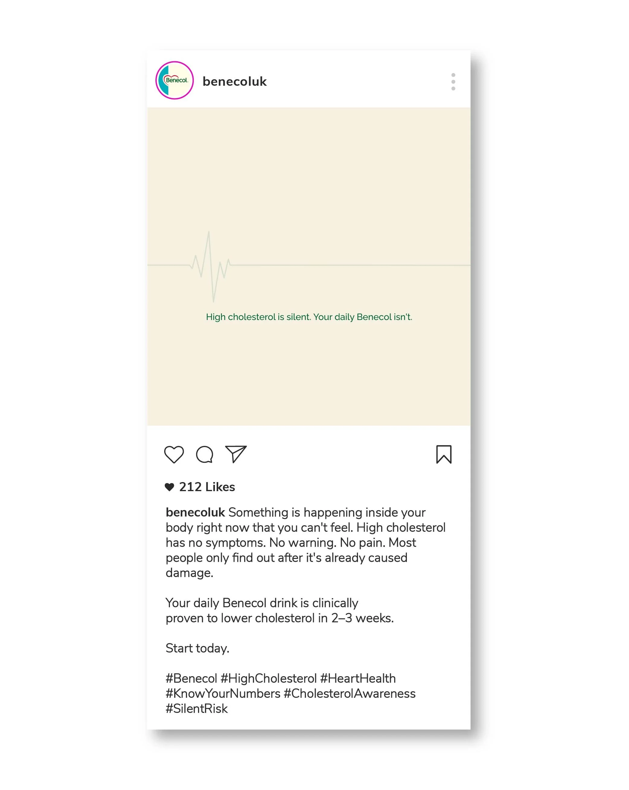
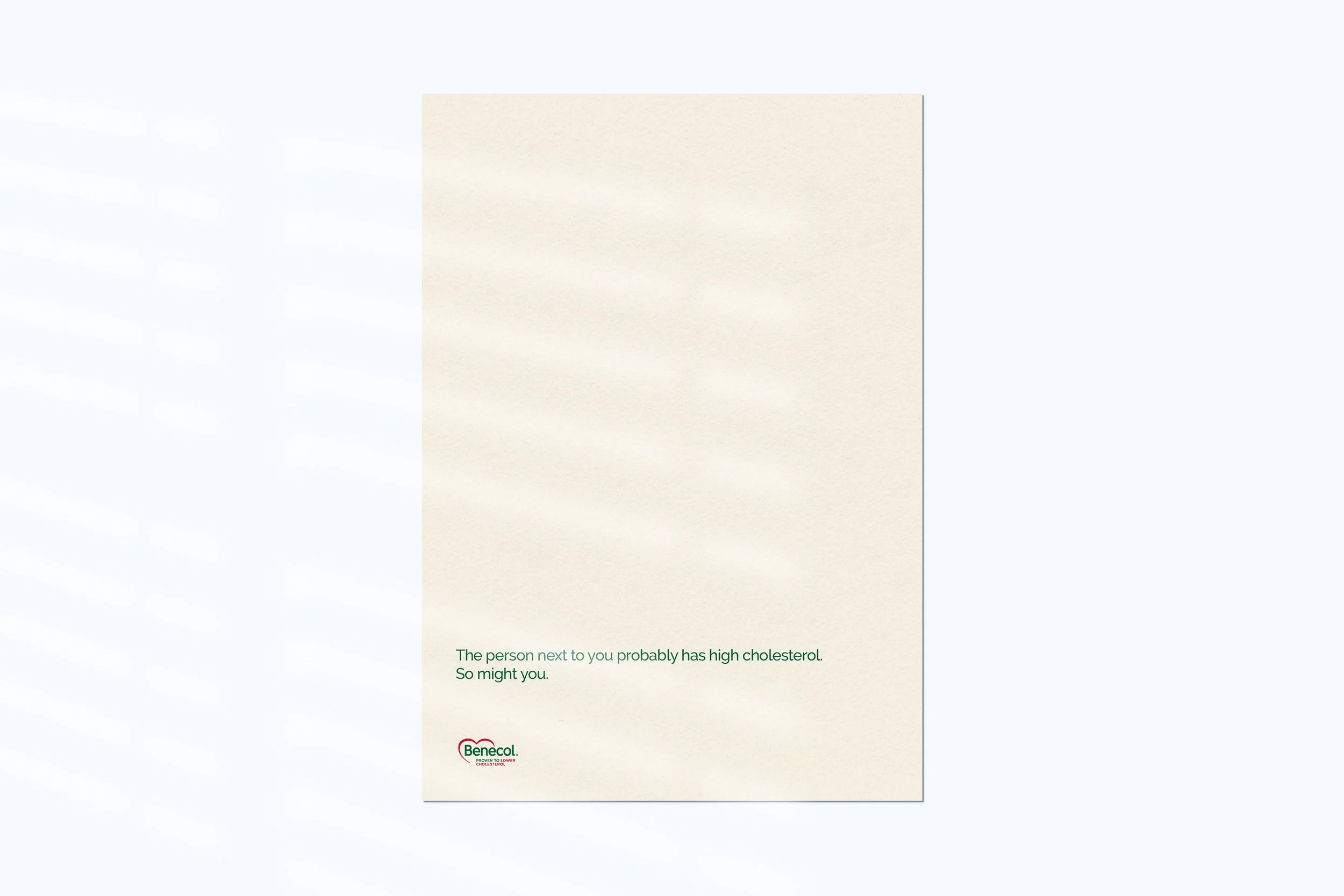
If the threat is invisible, the campaign should be too — almost nothing on the page, space where you'd expect content, reassuring statements that don't quite reassure. The discomfort is the message.
EXECUTION
A serif typeface was chosen deliberately against the warmth most health and wellness brands default to — the copy needed to read as a statement of fact, not a comforting tone of voice. Colour was reduced right down to the existing Benecol green, a near-black, and an off-white background, used consistently throughout. Space became an active part of the design rather than a neutral background, and the product itself only appears where it earns its place — small, incidental, almost an afterthought rather than the hero.
NOTE:
Self-initiated concept project. All creative strategy and design by Fariha Iqbal. Not produced in partnership with Benecol or its agencies.