FLO · RESEARCH INSIGHTS · DATA VISUALISATION · EDITORIAL DESIGN
The Women's Health Education Gap
Lead Designer
FOCUS
Clarity · Empathy · Brand cohesion
OVERVIEW
DELIVERABLES
A data-led editorial campaign for Flo — transforming sensitive multi-market research on women's health into a digital experience that felt human rather than clinical, and empowered users rather than overwhelming them.
THE OPPORTUNITY
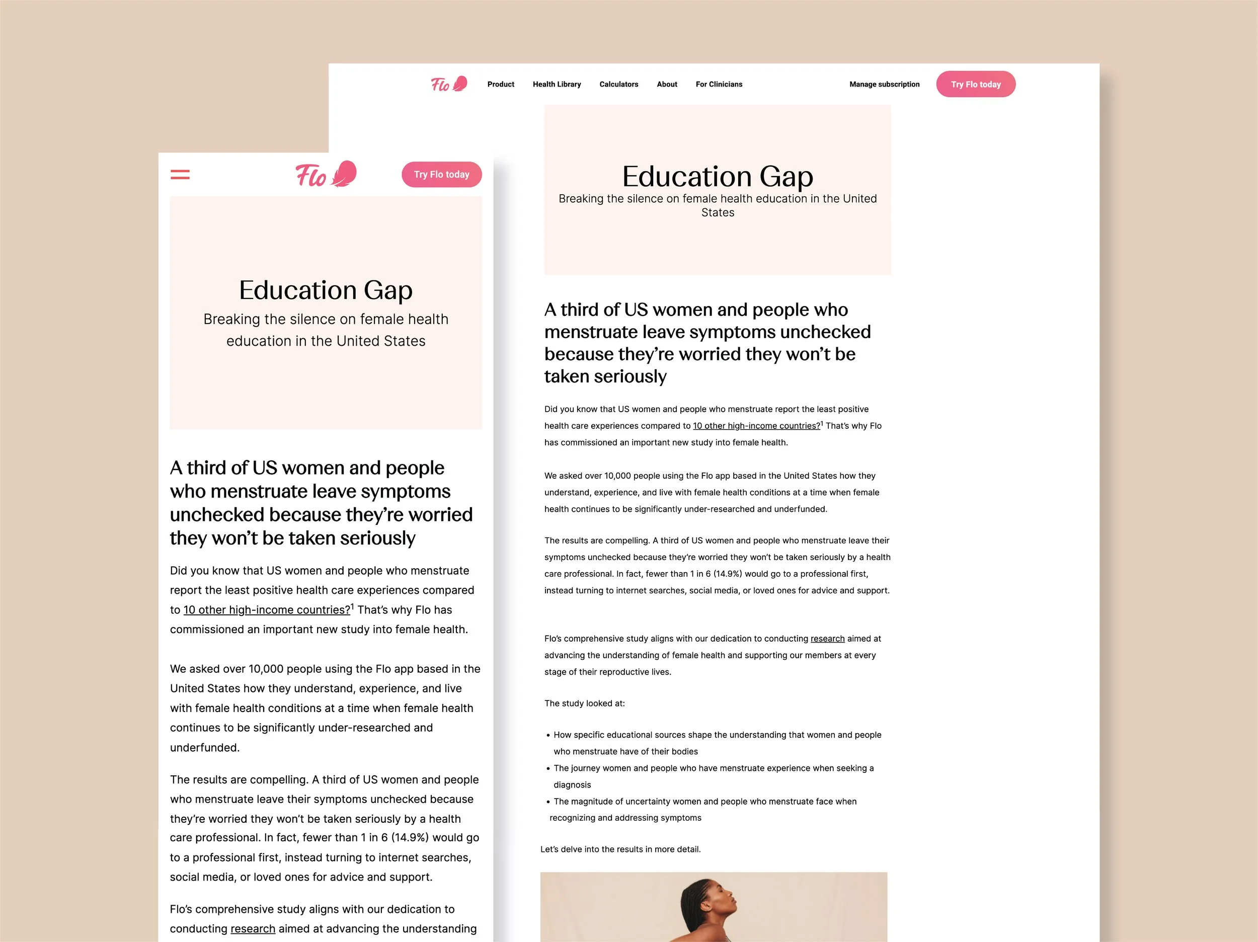
Flo identified a significant gap in menstrual and reproductive health education, supported by survey data from over 10,000 people across the US. The research revealed that a third of women and people who menstruate leave their symptoms unchecked — worried they won't be taken seriously by a health care professional. The brief was to turn those findings into a long-form editorial experience that balanced data rigour with empathy — not a dense report, but a story grounded in lived experience.
Editorial layout · Data visualisation · Digital design
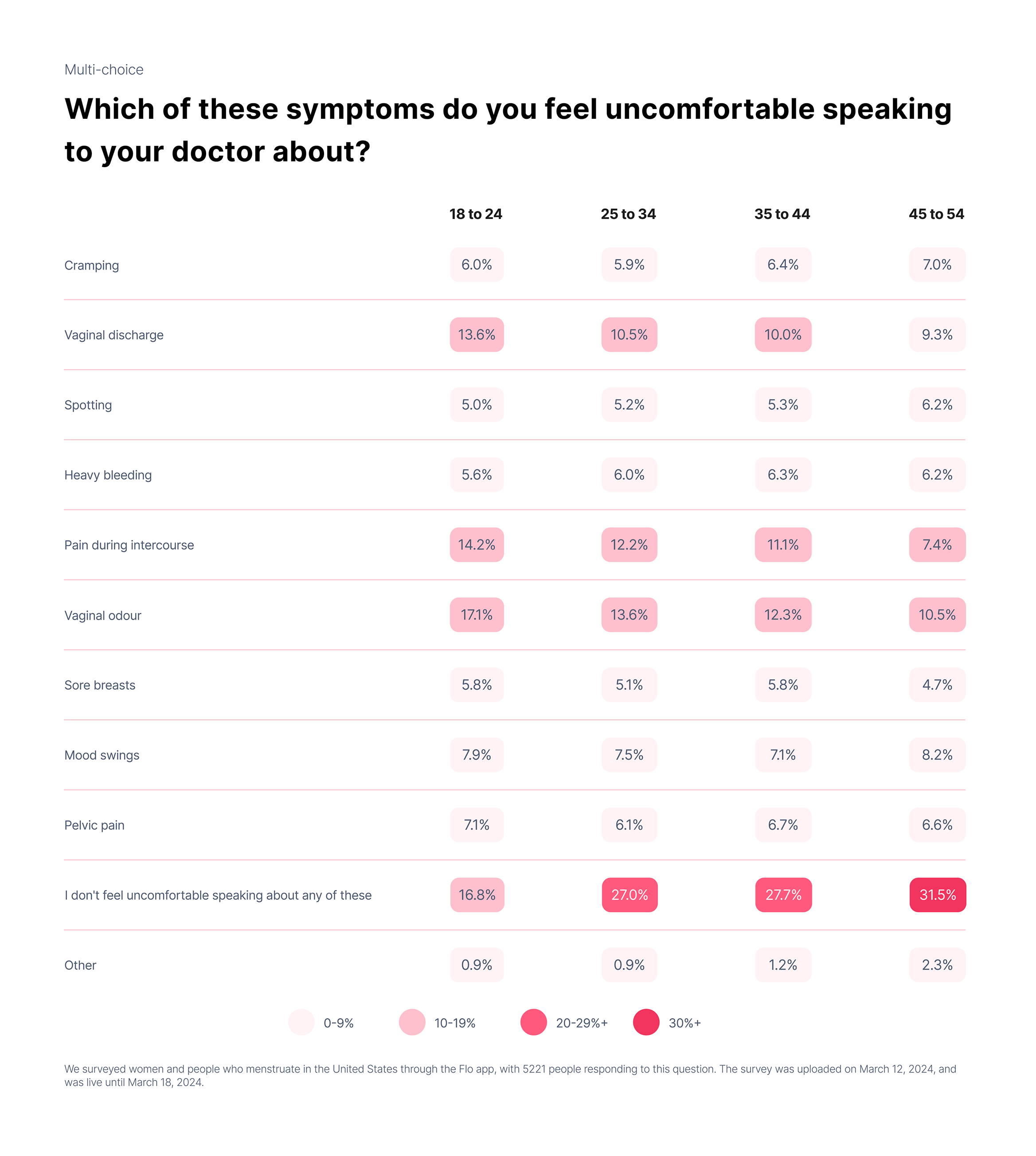
I art directed and designed the campaign as a progressive editorial journey, introducing insights gradually rather than front-loading data. Typographic scale, spacing, and structured data placements created rhythm across the page — ensuring findings felt digestible and intentional throughout.
DESIGNING THROUGH COLOUR HIERARCHY
IMPACT
WHAT I DID
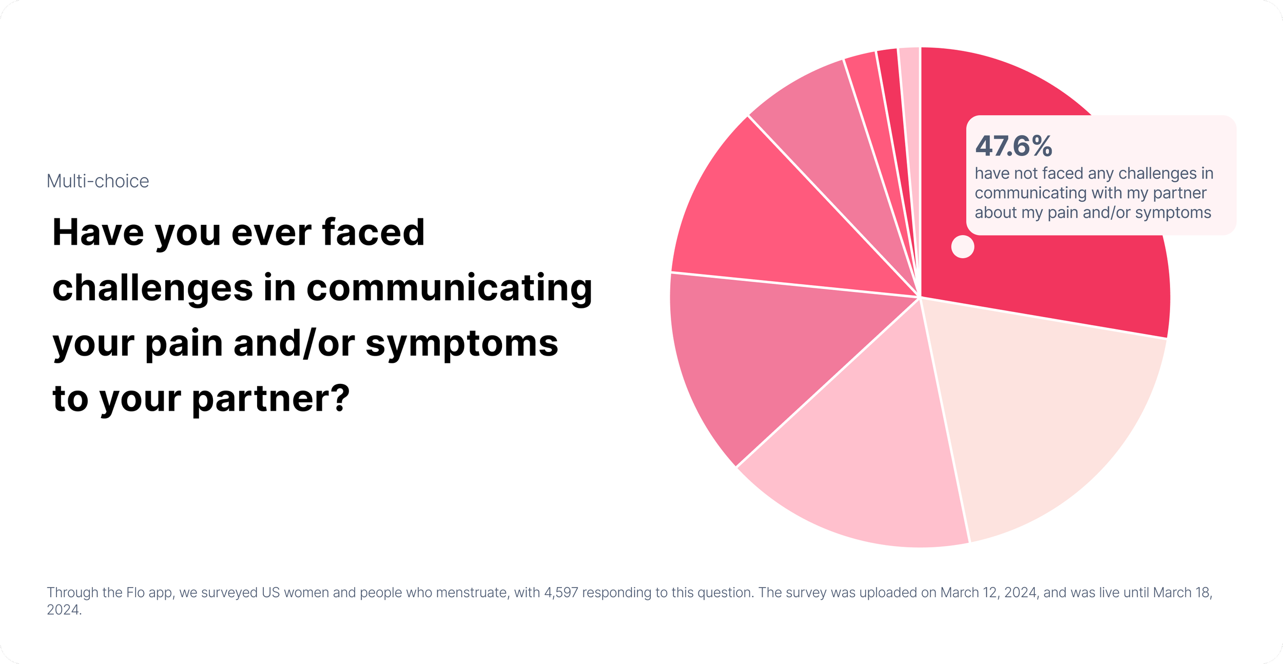
Data visuals evolved from full circular pie charts into semi-circle formats, allowing stronger emphasis on key percentages and cleaner alignment within Flo's layout. Colour was applied strategically within Flo's brand palette — primary responses prioritised, secondary data softened — reducing cognitive load while maintaining brand cohesion.
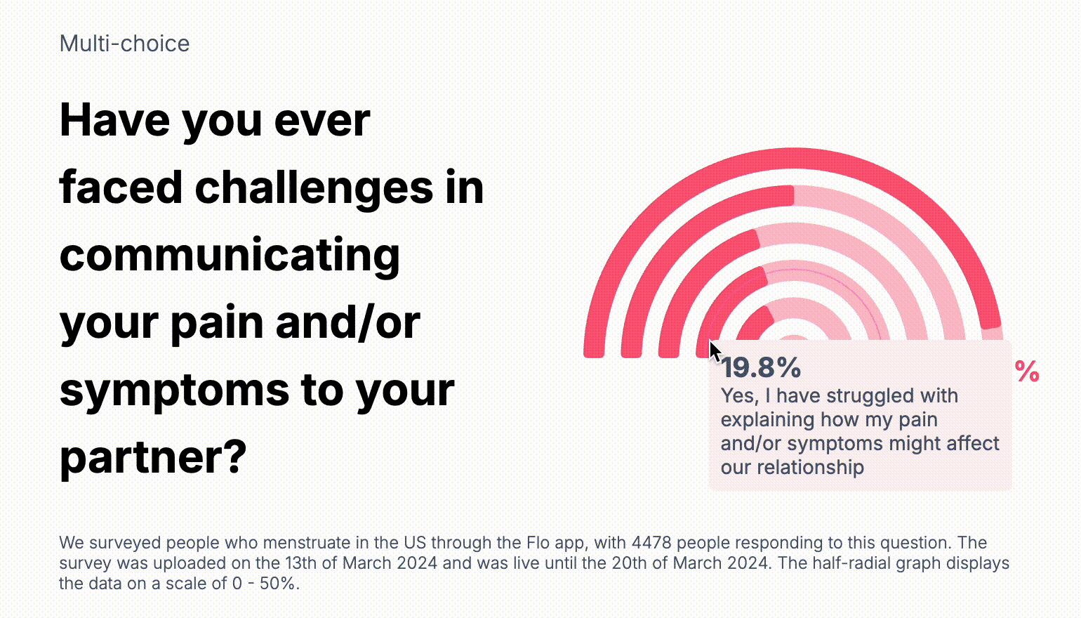
For emotionally sensitive data — such as questions about communicating pain or symptoms to a partner — the visual system relied on deliberate colour hierarchy rather than labelling alone. Working within Flo's established brand palette, tones were applied strategically: primary responses prioritised, secondary data softened, and attention guided intentionally throughout.
This reduced cognitive load and supported immediate comprehension without compromising brand cohesion — ensuring the data felt considered rather than clinical.
Delivered a cohesive digital campaign that balanced clarity, empathy, and structure — demonstrating responsible communication of sensitive data at scale.
Survey reached 10,444 women and people who menstruate across the United States — with at least 4,478 responding to every question · Complex, sensitive research transformed into a clear, accessible editorial experience · Delivered within Flo's existing brand framework — design system applied strategically without requiring new brand assets.
ROLE