VERVE SEARCH · CONCEPT BRAND IDENTITY · BRAND · DIGITAL · PRINT · SOCIAL
Verve Search — Re-identified
Designer
FOCUS
Concept · Identity · Visual System
OVERVIEW
A concept brand identity for Verve Search — a digital PR agency with a clear point of view and an identity that no longer matched it.
THE OPPORTUNITY
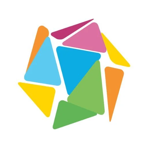
Verve Search is a bold, digital PR agency. They say it plainly: We Don't Do Boring. But the existing identity — a fragmented multicolour mark, soft and scattered — told a different story. Busy where it should have been confident. Dated where it needed to feel current.
The brief came from the team. My job was to answer it.
THE IDEA
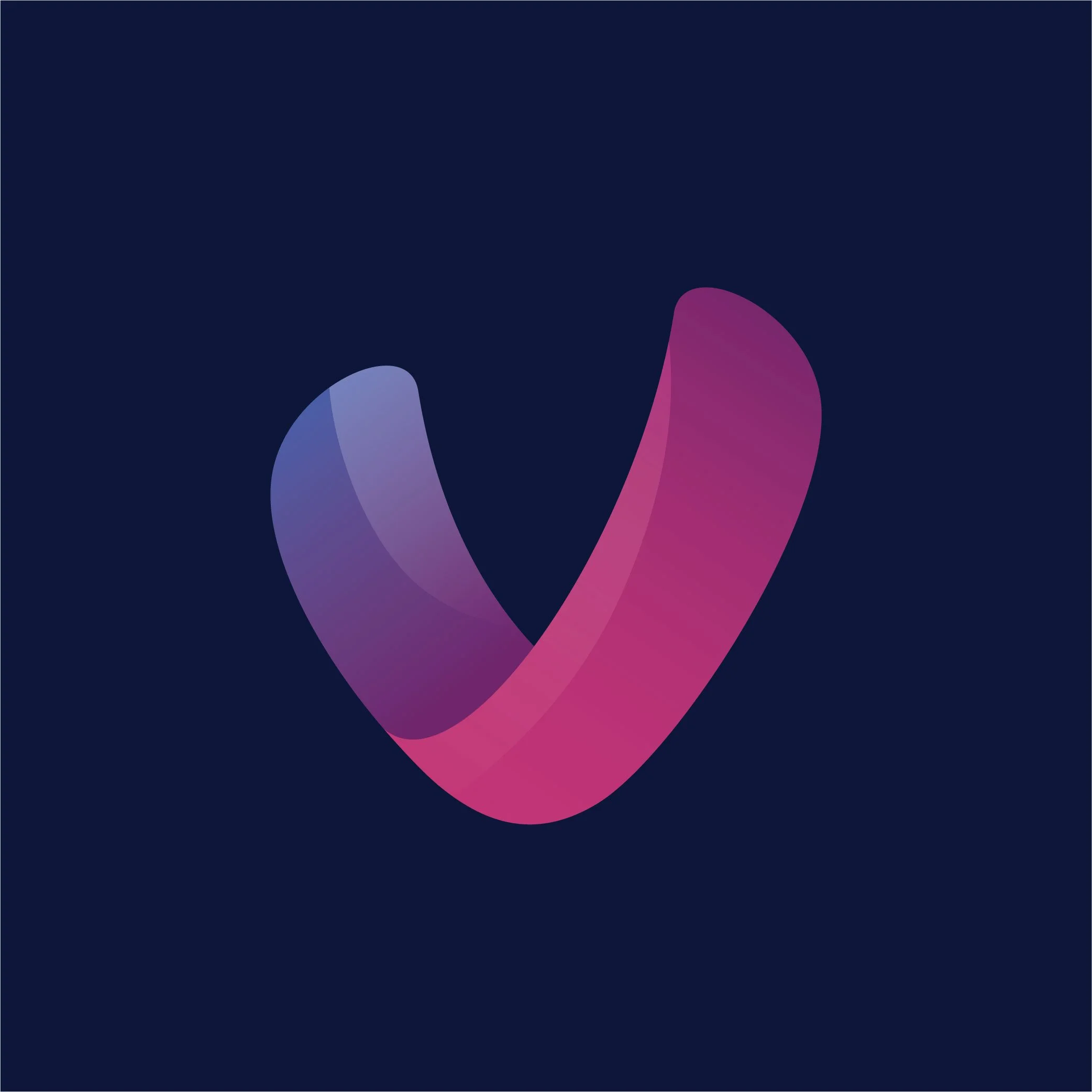
Start with what the name actually means. Verve — energy, forward motion, something that moves. The mark became a single continuous form: two overlapping fluid shapes that suggest momentum without spelling it out. Reduced to two colours. Confident enough to hold space on its own.
Everything else followed from that.
THE WORK
Brand mark
new
Colour and typography
The palette was stripped back to navy, magenta, and white. Enough contrast to be bold, enough restraint to feel considered. Typography shifted to a clean, geometric sans-serif — direct and characterful at display size, legible in body copy.
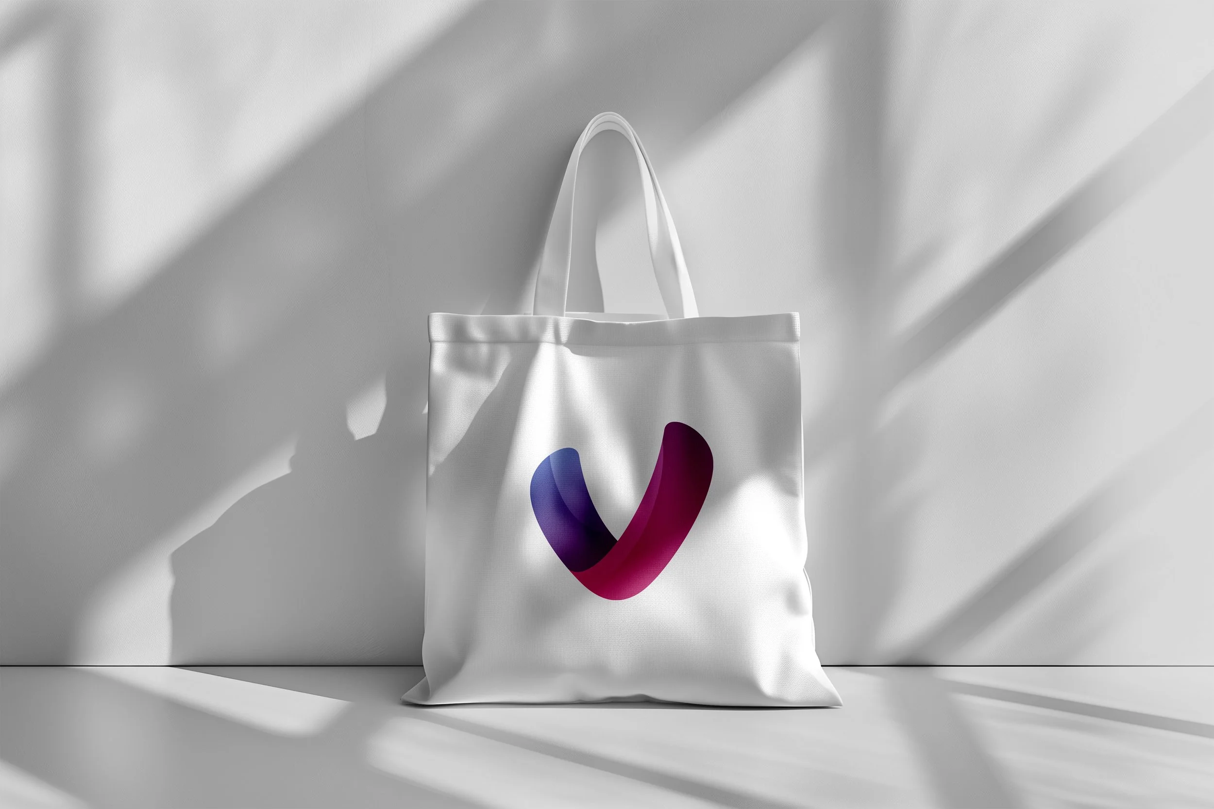
The old logo used multiple colours and a fragmented shape. The new mark distils it to a single fluid symbol — deep navy and magenta, overlapping, in motion. It reads clearly at any size and carries the agency's personality without needing to shout.
old
ROLE
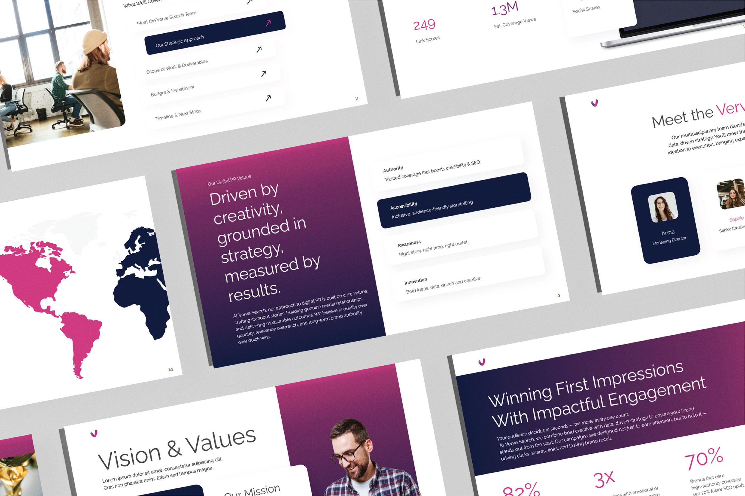
Pitch deck template
The identity applied to a full client-facing pitch deck — the most visible internal touchpoint for any agency. Layout built on a clear grid, with space used actively rather than filled.
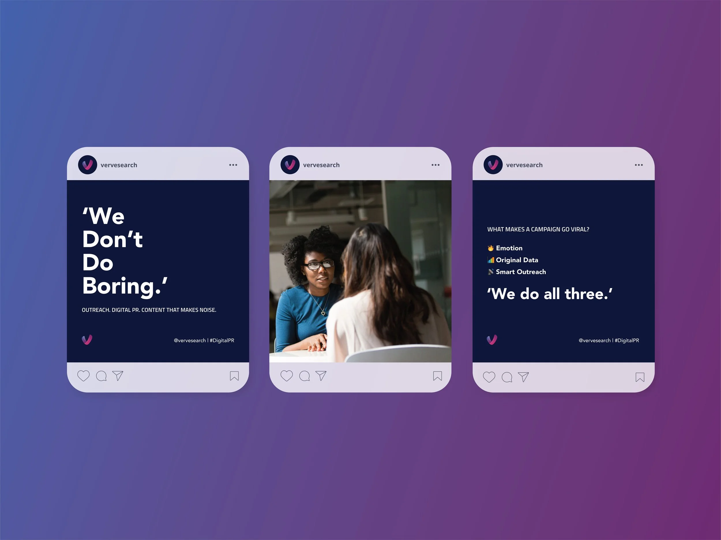
Social templates and stationery
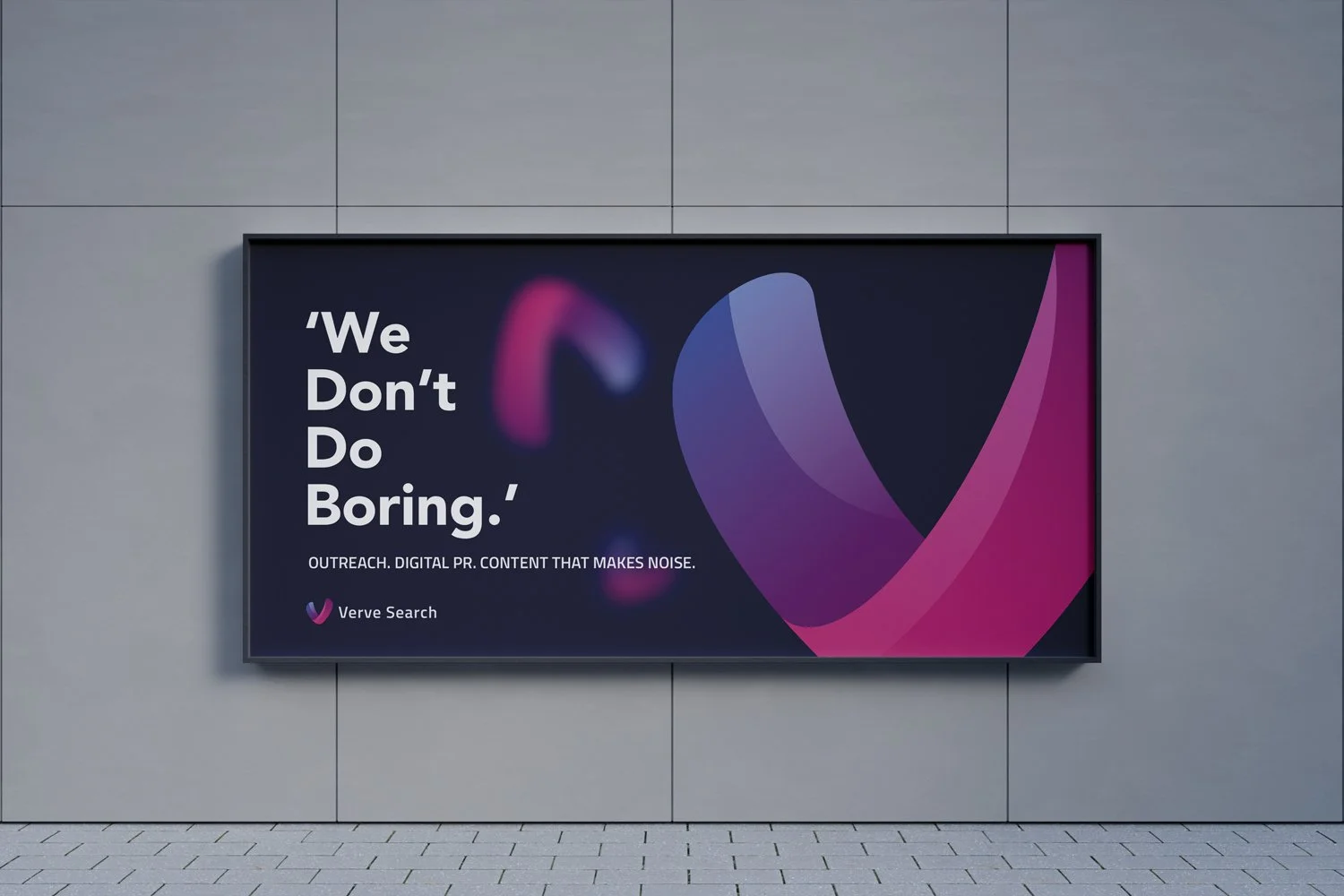
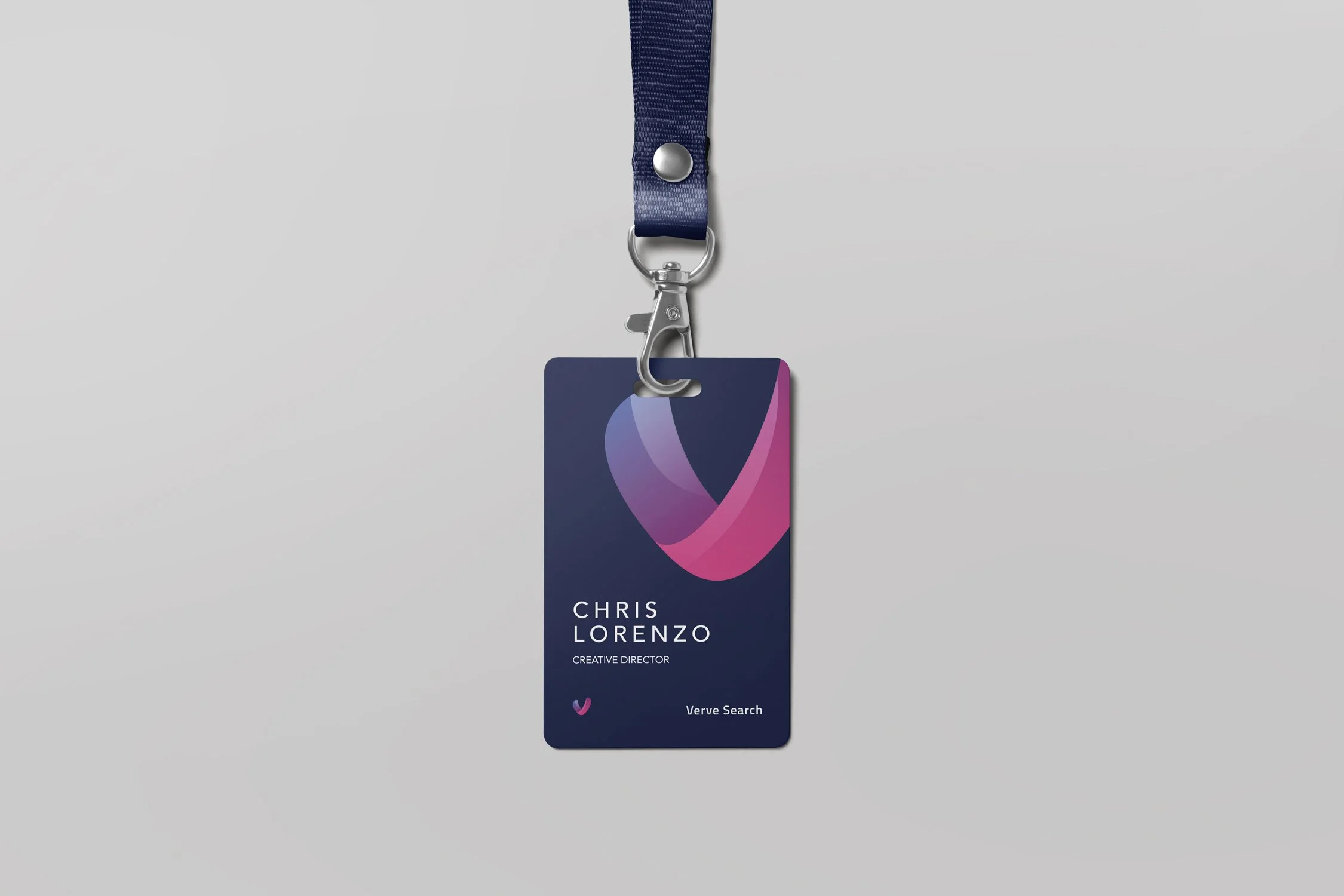
The brand mark and typographic system extended across social content and stationery. Each execution uses the same visual logic — showing how the identity scales down as well as up. Brand consistency is most easily lost at the small end. These show it holds.
Design Decisions
Every decision was made to support one idea: an agency that is serious about creative work should look like it. The gradient in the mark adds depth without decoration. The reduced palette stops the identity competing with the work it's framing. The typographic system is deliberately unfussy — the personality comes from the brand, not the font.
The system was designed to flex across touch points without losing coherence. Each application works independently; together they read as a single, confident identity.
NOTE
Concept project developed during my time at Omnicom Media Group. All creative direction and design by Fariha Iqbal.